|
|
This is the rubric used to correct the assignment on Tukey charts.
Presentation
Corrections are needed if any of the following is present:
-
The chart includes un-named labels such as "Series 1" and "Series
2."
-
The markers in the control line were not removed.
-
The chart does not have a title
-
The X-axis does not have a title
-
The Y-axis does not have a title
-
The chart is not easy to find.
-
The questions were answered in two separate files
-
The questions were answered in the same worksheet
-
Colors used in the chart and in the cell values, do not help in
understanding of the work
-
Except for the data, all cell values should be calculated as a
formula. Make sure that the moving range is calculated by formula.
Make sure that the control limits are calculated by formula. If this is not the case, it is very important that you
point this out. You should be able to change a data value and all
calculations should change automatically.
Accuracy
Response to Question 1:
.
|
Time period |
1 |
2 |
3 |
4 |
5 |
6 |
7 |
8 |
|
Observations |
90 |
85 |
92 |
67 |
98 |
83 |
94 |
90
|
|
UCL |
106.5 |
106.5 |
106.5 |
106.5 |
106.5 |
106.5 |
106.5 |
106.5 |
|
LCL |
70.5 |
70.5 |
70.5 |
70.5 |
70.5 |
70.5 |
70.5 |
70.5 |
|
|
|
|
|
|
|
|
|
|
|
Sorted data |
|
|
|
|
|
|
|
|
|
67 |
Median |
90 |
|
|
|
|
|
|
|
83 |
1 quartile |
84 |
|
|
|
|
|
|
|
85 |
3 quartile |
93 |
|
|
|
|
|
|
|
90 |
Inter-quartile |
9 |
|
|
|
|
|
|
|
90
|
UCL |
106.5 |
|
|
|
|
|
|
|
92 |
LCL |
70.5 |
|
|
|
|
|
|
|
94 |
|
|
|
|
|
|
|
|
|
98 |
|
|
|
|
|
|
|
|
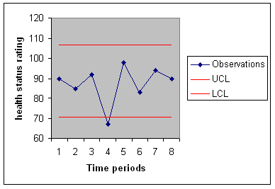
In the 4th period the health status had significant change.
Response to Question 2
|
Day |
Minutes of exercise |
UCL Tukey |
LCL Tukey |
Sorted data |
|
|
|
1 |
25 |
52.5 |
0 |
0 |
Median |
22 |
|
2 |
30 |
52.5 |
0 |
0 |
1 quartile |
15 |
|
3 |
32 |
52.5 |
0 |
15 |
3 quartile |
30 |
|
4 |
0 |
52.5 |
0 |
15 |
Inter-quartile |
15 |
|
5 |
15 |
52.5 |
0 |
15 |
UCL |
52.5 |
|
6 |
17 |
52.5 |
0 |
17 |
LCL |
-7.5 |
|
7 |
15 |
52.5 |
0 |
20 |
|
|
|
8 |
40 |
52.5 |
0 |
24
|
|
|
|
9 |
15 |
52.5 |
0 |
25 |
|
|
|
10 |
28 |
52.5 |
0 |
28 |
|
|
|
11 |
0 |
52.5 |
0 |
30 |
|
|
|
12 |
60 |
52.5 |
0 |
32 |
|
|
|
13 |
20 |
52.5 |
0 |
40 |
|
|
|
14 |
24
|
52.5 |
0 |
60 |
|
|
|
Day |
Minutes of exercise |
At least 30 minute exercise |
Duration of exercise |
UCL |
|
|
|
1 |
25 |
0 |
0 |
2.644994 |
|
Count |
|
2 |
30 |
1 |
1 |
2.644994 |
Missed exercise |
10 |
|
3 |
32 |
1 |
2 |
2.644994 |
30 min exercise |
4 |
|
4 |
0 |
0 |
0 |
2.644994 |
R |
0.4 |
|
5 |
15 |
0 |
0 |
2.644994 |
UCL |
2.644994 |
|
6 |
17 |
0 |
0 |
2.644994 |
|
|
|
7 |
15 |
0 |
0 |
2.644994 |
|
|
|
8 |
40 |
1 |
1 |
2.644994 |
|
|
|
9 |
15 |
0 |
0 |
2.644994 |
|
|
|
10 |
28 |
0 |
0 |
2.644994 |
|
|
|
11 |
0 |
0 |
0 |
2.644994 |
|
|
|
12 |
60 |
1 |
1 |
2.644994 |
|
|
|
13 |
20 |
0 |
0 |
2.644994 |
|
|
|
14 |
24
|
0 |
0 |
2.644994 |
|
|
|
Day |
Minutes of exercise |
UCL |
LCL |
Difference |
|
1 |
25 |
74.69626 |
0 |
|
|
2 |
30 |
74.69626 |
0 |
5 |
|
3 |
32 |
74.69626 |
0 |
2 |
|
4 |
0 |
74.69626 |
0 |
32 |
|
5 |
15 |
74.69626 |
0 |
15 |
|
6 |
17 |
74.69626 |
0 |
2 |
|
7 |
15 |
74.69626 |
0 |
2 |
|
8 |
40 |
74.69626 |
0 |
25 |
|
9 |
15 |
74.69626 |
0 |
25 |
|
10 |
28 |
74.69626 |
0 |
13 |
|
11 |
0 |
74.69626 |
0 |
28 |
|
12 |
60 |
74.69626 |
0 |
60 |
|
13 |
20 |
74.69626 |
0 |
40 |
|
14 |
24
|
74.69626 |
0 |
4 |
|
Average |
22.92857 |
|
|
19.46154 |
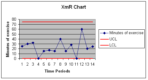
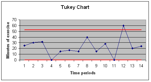
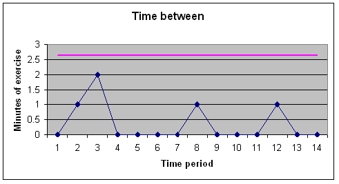
Of all the three charts, only
Tukey chart was able to detect points out of the control limits. Tukey
chart might be the most reasonable way of analyzing this data, it provides the
tightest limits on the data.
Copyright © 1996
Farrokh
Alemi, Ph.D. Most recent revision
09/04/2008.
This page is part of the course on
Quality/Process Improvement.
|