|
 |
|||||||||||||||||||||||||||||||||||||||||||||||||||||||||||||||||||||||||||
Moving Average Chart |
|||||||||||||||||||||||||||||||||||||||||||||||||||||||||||||||||||||||||||
|
Sometimes, you do not have multiple observations per time period, therefore you cannot take the average of these observations, and draw an X-bar chart. Sometimes all you have is one observation for each time period. This is especially the case when you are tracing data about your own self-improvement. In these circumstances, you typically have one data per period. Here is an example. Suppose I was tracing our unit's profitability on a monthly basis. Let's say that in the past 8 months the rate has been as follows:
How would you analyze this data? Because we are not dealing with the data averaged for each time period, we cannot assume that data have a normal distribution. Therefore, we cannot use the procedures we learned in the X-bar chart. Moving averages provide an alternative that overcomes the problem of lack of multiple observations per time period. The idea is to create artificial time periods for which we do have multiple observations, perhaps through combining several months together. For example, we can look at the average of the data for any 4-month period. To do so, you need to arrange the data in the following format:
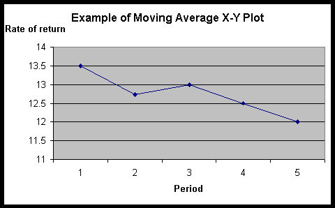
Note that each group of months starts with a new month and goes for the next three months. Note that many of the dates are repeated. The previous 8 periods have now been transformed into 5 periods, each period involving 4 months. Now the data for these 4 months can be averaged and the rules of X-bar charts can be used to analyze the data. The first step in the analysis is to calculate the average for each time period. For the first time period this will be (15+12+14+13)/4 = 13.5
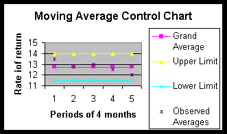
Once the averages for the time periods have been calculated, we create an X-Y plot of these data. Note that the data show that there is a persistent downward trend. This intuition may or may not be supported by our analysis. We will have to wait and pass judgment after we have concluded our analysis. As in X-bar chart analysis, the next step in the analysis is to calculate the grand average and the standard deviation of the observations. The grand average is calculated by summing all observations, not including the repeated observations, and dividing it by the total number of observations. Thus, in our example, this will be: Grand average = (15+12+14+13+12+13+12+11)/8 = 102/8 The standard deviation of the observations is also calculated as before by the following formula: Standard deviation = Square root (Sum for all observations (Square of (observation - grand average)))/(number of observations minus one) For our data, the standard deviation is calculated in the following table:
After calculating the standard deviation of the observations, one must calculate the standard deviation of the sample. This is calculated according to the following formula: Standard deviation of the sample = Standard deviation of the observations / Square root of the number of observations in the sample In the case of our data, we have taken samples of size 4; therefore the standard deviation of each sample is equal to 1.28 divided by the square root of 4. This value is The upper and lower control limits for 95% confidence intervals are calculated by the formulas: Upper control limit = grand average + 1.96 * standard deviation of sample Lower control limit = grand average - 1.96 * standard deviation of sample Where does the 1.96 come from? In a normal distribution, the mean plus and minus 1.96 times the standard deviation of the distribution contains 95% of the data. When the number of observations is small, the use of this number makes sense only if the assumption of Normal distribution of the data can be verified. Otherwise, we suggest you use the t-student value corresponding to the sample size. Using the constant 1.96, we calculate the control limits as: Upper limit = 12.75 + 1.96*0.64 Lower limit = 12.75 - 1.96*0.64
The following is a picture of the data analyzed through a moving average control chart: Note that the observations are not drawn on the chart. Only the average of the observations is drawn. If for example we had drawn the first month's rate of return of 15, it would be higher than the upper limit. This would have misled us to believe that some months are out of control. We cannot directly draw the observations because the control chart is based on assumption of normal distribution, which is only met for averages across 4-month periods. A quick look of the chart suggests that the data are within limits. Our first intuition that there is a downward trend is not supported by our analysis of the data. This page is part of the course on Quality/Process Improvement. This page was first prepared on January 1990 and last revised on 01/15/2017. |
|||||||||||||||||||||||||||||||||||||||||||||||||||||||||||||||||||||||||||