 A Thinking Person's Weight Loss & Exercise Program
|
|||||||||||||||||||||||||||||||||||||||||||||||||||||||||||||||||||||||||||||||||||||||||||||||||||||||||||||||||||||||||||||||||||||||||||||||||||||||||||||||||||||||||||||||||||||||||||||||||||||||||||||||||||||||||||||||||||||||||||||||||||||||||||||||||||||||||||||
Control Charts for Diet and Exercise
Farrokh Alemi, Ph.D. Duncan Neuhauser, Ph.D. Nancy Tinsley
This chapter helps you construct a control chart for your diet and exercise patterns. At this point in your improvement effort, you may have made a change in your lifestyle, collected data on weight or exercise patterns and are wondering if the change has led to improvement. The key question is whether the current weight and exercise time compare favorably to historical patterns. If you are like most people, your weight and exercise time fluctuates a great deal. There are many reasons for this variation. Sometimes your weight or exercise patterns are not measured precisely. Sometimes variations are introduced because you forget to take a measure. Sometimes your weight fluctuates by a few pounds merely based on water absorption or the clothes you are wearing. All these fluctuations make it difficult to gauge whether new values are different from historical values. The five pound weight loss you might ecstatic about might just be a random variation. Some level of rise and fall is natural; the real question is whether your new weight and exercise patterns indicate a true departure from historical levels. A control chart can help you answer this question. This chapter assumes that you can plot data, order numbers from small to large, and calculate square root of a number. These are relatively simple tasks but some people may have little experience with data manipulation. This type of analysis needs time and patience. If you feel uncomfortable analyzing data, you may want to look up Web pages in which you supply your data and the web draws the control chart for you (see http://www.rapidimprovements.com). You can also of course ask a friend or a clinician to do the analysis for you.
What is a control chart?
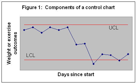
With a control chart, you monitor your progress over time. You create a plot, where the x-axis is days (day zero being the time you started your program) and the y-axis is the outcome you are monitoring. To decide if your outcomes are different from historical patterns, the upper and lower control limits ((UCL and LCL, respectively) are calculated. These limits are organized to constitute such a range that if your historical pattern has continued, 99 percent of time data will fall within these limits. The upper and lower control limits are calculated using mathematical formulas that are specific to the type of outcome you are monitoring. This chapter shows you how to calculate these limits depending on whether you are monitoring your weight, your exercise time, days of diet missed, days of exercise missed, or other similar outcomes. Figure 1 shows the structure of a typical control chart. In this figure all points but two fall within the control limits.
How to read a control chart?
A control chart is useful in many ways. Points outside the limits are unusual and mark departure from historical patterns. You have lost weight if your new measure is below the lower control limit. Two points in Figure 1 fall below the LCL – and therefore signal a weight loss. The other points do not indicate any real weight loss, even though there are a number of them showing a decrease in weight. These small fluctuations are random and not different from your historical changes in your weight. You can use a control chart to see if your exercise time exceeds the upper control limit. If it does, you are reassured that you are exercising more. If Figure 1 measured length of exercise, we would conclude that there has not been any increase in exercise time, since none of the points fall above the upper control limit. You can also use the control chart to see if you are maintaining your gains from previous time periods. If your data fall within the control limits, despite day-to-day variations, there has not been any change in your weight and exercise time. If you are at your ideal weight and exercise, then you want your data to fall within the limits.
Minimum number of observations
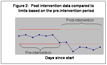
The more data you have, the more precision you have in constructing the upper and lower control limits. At a minimum, you need at least seven data points in the pre-intervention period to start most charts. Not all of the data are used for calculation of control limits; often the limits are based on the pre-intervention period. Subsequent post-intervention observations are then compared to the pre-intervention limits. If any points fall outside the limits, you can conclude that the intervention has changed your weight or exercise patterns. See Figure 2 for an example of setting limits based on pre-intervention periods.
Compare the chart in Figure 2 with the chart in Figure 1. Both are based on the same data, but Figure 2 sets the upper and lower control limits based on the first seven days, before the intervention. Figure 2 shows that post intervention data are lower than LCL and therefore a significant change has occurred. When Figure 2 is compared to Figure 1, we see that more points are outside the limits in Figure 2. By setting the limits to pre-intervention patterns, we were able to detect more accurately the improvements since the intervention.
Calculating limits
The mathematical formulas for calculation of control limits depend on what you are trying to monitor. Below we list the calculation of control limits for two types of measures:
Now we will discuss each of these limits separately.
Limits for numerical values (Tukey’s
approach)
|
|||||||||||||||||||||||||||||||||||||||||||||||||||||||||||||||||||||||||||||||||||||||||||||||||||||||||||||||||||||||||||||||||||||||||||||||||||||||||||||||||||||||||||||||||||||||||||||||||||||||||||||||||||||||||||||||||||||||||||||||||||||||||||||||||||||||||||||
|
Procedure for Calculating
Tukey’s Control Limits
LCL = Fourth – 1.5 * Fourth Spread UCL = Three-Fourths + 1.5 * Fourth Spread |
Let's look at an example where these calculations are put to work. Jane collected data in Table 1 regarding her exercise times. She planned to exercise 3 times a week and each time she exercised, she recorded the time in minutes. When she did not exercise, she recorded a zero for the exercise length. The first seven days recorded were pre-intervention. After this period, she and her spouse joined a mixed group volleyball team. She wanted to know whether joining the team had made a difference in her exercise time.
|
Table 1: Length of exercise |
||||
|
Day of observation |
Minutes |
Sorted in order of length of exercise |
||
|
Rank |
Day of observation |
Minutes of exercise |
||
|
1 |
30 |
1 |
2 |
0 |
|
2 |
0 |
2 |
3 |
25 |
|
3 |
25 |
3 |
1 |
30 |
|
4 |
30 |
4 |
4 |
30 |
|
5 |
35 |
5 |
5 |
35 |
|
6 |
40 |
6 |
6 |
40 |
|
7 |
50 |
7 |
7 |
50 |
|
8 |
45 |
|
|
|
|
9 |
31 |
|
|
|
|
10 |
20 |
|
|
|
|
11 |
40 |
|
|
|
|
12 |
60 |
|
|
|
|
13 |
45 |
|
|
|
|
14 |
60 |
|
|
|
|
15 |
45 |
|
|
|
|
16 |
32 |
|
|
|
|
17 |
50 |
|
|
|
|
18 |
60 |
|
|
|
The first step is to sort pre-intervention data in order of length of exercise. This is shown in the last column of Table 1. Next we calculate the median—the value where half the data (7 * .5 = 3.5 ~ 3 points) are below it and half (3 points) are above. The fourth data point, with a value of 30, is the median; three data points are below it and three are above.
Since the median is an actual data point in this case, we include it in the calculations of the Fourth. To calculate the Fourth, we determine the halfway point for the first half of the data. When we include the median, we have four points in the lower data set, 0, 25, 30 and 30. The Fourth is halfway between the second and third points, in other words between 25 and 30, which is 27.5.
To calculate the Three-Fourths, we calculate the halfway point for the upper half of the data. Again because the median is an actual data point, we include it in the upper data set. With the median, we have four data points for the highest values. The Three-Fourths is between the fifth and sixth data points (between 35 and 40), and therefore its value is 37.5.
The Fourth Spread is the difference between Fourth and Three-Fourths, which is 37.5 – 27.5 = 10. The UCL is calculated as the sum of Three Fourths and one and a half times Fourth Spread:
Upper Control Limit = 37.5 + (1.5 * 10) = 52.5
The LCL is calculated as the Fourth minus one and a half times the Fourth Spread:
Lower Control Limit= 27.5 – (1.5 * 10) = 12.5
A chart of the data, containing both the Upper and Lower limits are provided in Figure 3:
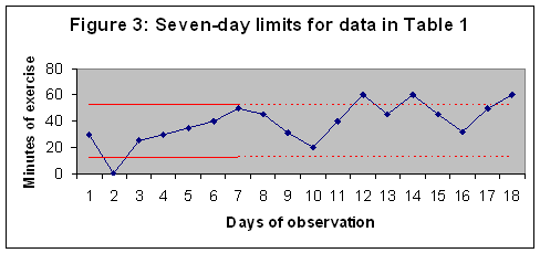
The chart shows that in the first seven days, there was one very low point (of no exercise), a statistical abnormality. After the first seven days (used for setting the limits), on three occasions the total exercise time exceeded the UCL. In these three days, there was a real increase in exercise time compared to the first seven days. If these days correspond to joining the volleyball team, the intervention seems to have worked.
Let us look at another example, this time on weight loss. A 48-year-old man measured his weight for eight weeks. Then, he and his spouse changed food shopping habits. They excluded all sweets from their shopping (they stopped buying colas, sweetened beverages, sweetened cereals, and chocolates). The data for this person are provided in Table 2. Weight was recorded once a week.
|
Table 2: Recorded weight values |
|||
|
Week |
Pounds over ideal weight |
Sorted values |
|
|
Rank |
Pounds over ideal weight |
||
|
1 |
10 |
1 |
3 |
|
2 |
11 |
2 |
5 |
|
3 |
7 |
3 |
5 |
|
4 |
5 |
4 |
7 |
|
5 |
10 |
5 |
8 |
|
6 |
5 |
6 |
10 |
|
7 |
3 |
7 |
10 |
|
8 |
8 |
8 |
11 |
|
9 |
6 |
|
|
|
10 |
6 |
|
|
|
11 |
3 |
|
|
|
12 |
0 |
|
|
|
13 |
4 |
|
|
|
14 |
-1 |
|
|
|
15 |
-5 |
|
|
|
16 |
-2 |
|
|
As before, the first step is to sort pre-intervention data from smallest amount of pounds over ideal weight to the highest value. This is shown in the last column of Table 2. Next, we calculate the median, which is the value where half the data (8 * .5 = 4 points) are below it and half (4 points) are above. The value should be between the fourth and fifth data points, or between 7 and 8, so the median is 7.5.
Since the median in this case is not an actual data point, we do not include it in the calculations of Fourth. We have four points in the lower data set, 3, 5, 5, and 7. The Fourth is halfway between the second and third points, in other words between 5 and 7—so it is 6.
To calculate the Three-Fourths, we calculate the halfway point for the upper half of the data. Again because the median was not an actual data point, we do not include it in the upper data set. We have four data points for the highest values. The Three-Fourths is between the sixth and seventh data points (between 9 and 10), and therefore is 9.5.
The Fourth Spread is 9.5 – 6 = 3.5. The UCL is 9.5 + (1.5 * 3.5) = 14.75. The LCL is 6 – (1.5*3.5) = 0.75. A chart of the data is provided in Figure 3:
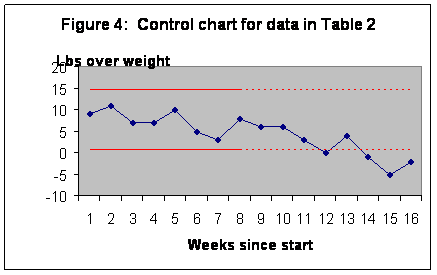
The examination of the chart shows that in the first eight weeks, all data points were within the limit. No weight was lost in the pre-intervention period, even though there was a considerable amount of fluctuation. Over the remaining eight weeks and compared to the first eight weeks, on four occasions the weight was lower than the LCL. Based on this analysis we can conclude that there was a real decrease in weight in the post-intervention period.
Limits for days missed
Alemi and colleagues suggest how control limits can be calculated for days a habit is missed.[2] For the following discussion we assume that you have recorded days you stayed with your plans and days you missed. We also assume that most of the time you stayed with the plan. We then construct the limits on length of time in between missed days. The chart is constructed by plotting the number of missed days (length of time) on the y-axis and time since start on the x-axis. The rules for calculating the length of time between missed days are described in Table 3.
|
Table 3: Rules for calculating the length of missed-days[3] |
||
|
Today |
Number of missed-days |
|
|
No data |
Missed day |
1 day |
|
No data |
Habit kept |
0 day |
|
Habit kept |
Habit kept |
0 day |
|
Missed day |
Habit kept |
0 day |
|
Habit kept |
Missed day |
1 day |
|
Missed day |
Missed day |
1 + yesterday’s length of missed day |
|
Procedure for Calculating Limits for Missed Days
|
The upper control limit (UCL) depends on R, the ratio of missed days over days stayed with the plan. It is calculated as:
UCL = R + 3 [R * (1+R)] 0.5
In the above formula, R is calculated as:
|
R= |
Number of missed days |
|
Number of days plans kept |
There is no LCL, as missed-days are rare and the LCL will always be zero for a rare event. The UCL is typically calculated by using post-intervention data and projecting it to pre-intervention period. We expect that in the pre-intervention period the length of missed days would be above the control limit derived from the post-intervention period. An example can demonstrate the use of missed day limits.
Table 4 shows data collected over 18 days by a 35-year-old woman trying to exercise more. She decided to take morning showers at the gym and thus combined her exercise and shower routines. The first week shows the data before the intervention. The remaining days show the data after the intervention. The question was whether this new habit had led to increased use of the gym.
|
Table 4: Missed days of exercise |
||
|
Day |
Missed? |
Duration of string of missed days |
|
1 |
No |
0 |
|
2 |
Yes |
1 |
|
3 |
Yes |
2 |
|
4 |
Yes |
3 |
|
5 |
No |
0 |
|
6 |
Yes |
1 |
|
7 |
Yes |
2 |
|
8 |
No |
0 |
|
9 |
No |
0 |
|
10 |
No |
0 |
|
11 |
No |
0 |
|
12 |
No |
0 |
|
13 |
No |
0 |
|
14 |
No |
0 |
|
15 |
No |
0 |
|
16 |
Yes |
1 |
|
17 |
No |
0 |
|
18 |
No |
0 |
|
R =0.13 |
||
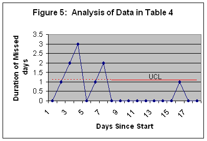
To construct the control chart, we first need to use the rules in Table 3 to calculate the duration of missed days. Note that missed days grow in length until she goes to the gym, at which point they are reset to zero. The last column in Table 4 shows the calculated length of missed days. The control limit is calculated from the post-intervention data, the data for days 8 through 18. There is one missed day and ten days on which she has kept up with her plans. Therefore R is calculated as 1/10 = 0.1. The UCL is then calculated as .1 + 3 * (0.1 * 1.1)0.5, which is 1.09. Figure 5 shows the resulting chart and control limit.
The chart in Figure 5 shows that during the pre-intervention period our subject had two strings of missed days. During the first string she did not go to the gym for three days. During the second, she did not go for two days. Both strings exceed the UCL calculated from post-intervention period. Compared to post-intervention period, these two strings of missed days are long enough to constitute a real change in the process. Based on these findings we conclude that the intervention was working and the rate of missed days has dropped.
Conclusion
In this chapter we demonstrated how two types of control charts can be constructed. One type is for the analysis of continuous data such as weight or length of exercise, and the other is for analysis of missed days in keeping up with plans.
The point of any control chart is to help you improve. The effort put into measurement and analysis is wasted if it does not help us reach our goals. Constructing a control chart is time-consuming and admittedly, for some, it can be difficult. But is there an alternative? Eschewing one leaves us at the mercy of wishful thinking. Without a control chart, many err in detecting real changes in their weight and exercise times; they mistake random fluctuations for real progress. Control charts help discipline our intuitions to see beyond these random rises and falls of weight and exercise frequency.
[1] Tukey’s box plots describe confidence intervals for data using “Fourth Spreads.” We have expanded the procedures reported by Tukey to set limits for control charts. For more details see David C. Hoaglin and John Wilder Tukey, eds., Understanding Robust and Exploratory Data Analysis. Wiley Series in Probability and Mathematical Statistics, 1st ed., John Wiley & Sons, New York, 2000.
[2] The methods described here are based on the following two papers: F. Alemi and D. Neuhauser, "Control Charts for Asthma Attacks," Joint Commission Journal on Quality 2004 Feb;30(2):95-102. F. Alemi, M. Haack, and S. Nemes, "Control Charts for Use in Family Drug Court," Addictive Behavior (in print). For a more mathematical discussion of time-in-between charts see J. C. Benneyan, 2001, Performance of Number-Between G-Type Statistical Control Charts for Monitoring Adverse Events, Health Care Management Science.
[3] These rules display strings of missed days as they grow in its length. Strictly speaking the statistical test of significance is made on the last day in the string and all intermediary days are plotted for display purposes only.
