|
 |
||||||||||||||||||||||||||||||||||||||||||||||||||||||||||||||||||||||||||||||||||||||||||||||||||||||||||||||||||||||||||||||||||||||||||||||||||||||||||||||||||||||||||||||||||||||||||||||||||||||||||||||||||||||||||||||||||||||||||||||||||||||||||||||||||||||||||||||||||||||||||||||||||||||||||||||||||||||||||||||||||||||||||||||||||||||||||||||||||||||||||||||||||||||||||||||||||||||||||||||||||||||||||||||||||||||||||||||||||||||||||||||||||||||||||||||||||||||||||||||||
|
||||||||||||||||||||||||||||||||||||||||||||||||||||||||||||||||||||||||||||||||||||||||||||||||||||||||||||||||||||||||||||||||||||||||||||||||||||||||||||||||||||||||||||||||||||||||||||||||||||||||||||||||||||||||||||||||||||||||||||||||||||||||||||||||||||||||||||||||||||||||||||||||||||||||||||||||||||||||||||||||||||||||||||||||||||||||||||||||||||||||||||||||||||||||||||||||||||||||||||||||||||||||||||||||||||||||||||||||||||||||||||||||||||||||||||||||||||||||||||||||
Tutorial on Risk Adjusted X-Bar Charts: Diabetes ControlFarrokh
Alemi, Ph.D. Purpose of Control charts
Several
investigators have reviewed the uses of statistical process control theory in
health care.
Applications have ranged from control of excess C-sections, to reduction
of medication errors, to prevention of patient falls, and a host of other
applications. In these applications
control charts are needed in order to discipline our intuitions about whether
changes we have introduced have led to improvements in care outcomes.
Decision makers often mistakenly attribute
positive outcomes to their interventions and negative outcomes to random chance
or external events. These
perceptions could be wrong. Control
charts enable us to avoid attribution errors regarding our effectiveness.
In
addition, control
charts tell a chronological and visual story.
They allow us to communicate to others whether
the intervention worked. Need for risk adjustment
In
the past decade and half, investigators have promoted the use of industrial
quality control techniques in health care.
But health care and manufacturing differ in one fundamental way.
Input to health care processes is not very much the same.
In many manufacturing processes, such as car making, the inputs, such as
a sheet of metal, are always the same. But
in health care, the input unit is usually a patient and the characteristics of
those patients may vary tremendously. Even
when patients have the same disease, they differ considerably by severity of the
disease and prognosis of their illness. This
difference between health care and industrial processes requires us to modify
statistical process control tools so that the tool is appropriate for the health
care setting. This paper shows how
patients’ risks can be used to adjust control charts, in particular the X-bar
control chart.
Risk
adjustments are needed so that we can separate changes in outcomes due to the
patient’s prognosis at start of their visit from changes that are due to our
intervention in processes of care. For
example, suppose we are trying to reduce c-section rates in our hospital. We introduce changes in care process and continue collecting
data on c-section rates. At the end
of our data collection effort, we are not sure if changes in outcomes are due to
the fact that we are now attracting less complicated pregnancies or truly we
have reduced our c-section rates. A
risk-adjusted control chart compares observed c-section rates to what could have
been expected from the patients’ pregnancy complications.
It allows us to statistically take out differences in outcomes that are
due to patients and attributes the remaining changes in outcomes to process of
care. Focus on X-bar charts
There
are many types of control charts available.
Some are designed to trace changes in proportions and probabilities of
adverse events (p-charts).
Others are useful in tracking data on one patient (e.g.
time-in-between-events chart). We focus on X-bar charts, a tool widely used for tracking
continuous variables (e.g., satisfaction ratings, key clinical findings, health
status ratings, etc.) over time. Data neededIn quality improvement, the purpose of data collection and analysis is not to set blame but to assist improvement efforts. The purpose is not to prove but to improve. Often data sets are small and conclusions refer only to process at hand and findings are not intended to be generalized to other environments. Two data elements are needed for constructing a risk adjusted X-bar chart include:
The data needed are available in many circumstances.
Expected outcomes can be based on clinician’s review of patients’ or
can be deduced from many commercial and non-commercial severity indices. Sample data
In
order to help the reader understand risk adjusted control charts, we will
present data from a recent analysis we conducted on diabetic patients of an
outpatient clinic. Type 2 Diabetes
Mellitus affects millions of Americans each year and, if not controlled, can
result in considerable morbidity. The
question of interest to the clinicians was whether they had improved over time
in helping their patients control diabetes.
Previous studies have shown that control charts can be constructed on
data collected from diabetes patients [vi].
We thought if we look at the average experience of the patients of
several providers, we would be able to speak to the skills of the provider in
helping their patients control their diabetes.
For our outcome variable, we decided to focus on Hemoglobin A1C levels
(HgbA1C) measured in Type 2 Diabetic patients.
Studies have shown that the microvascular complications of retinopathy,
nephropathy and neuropathy can be prevented with good control of the blood sugar
levels [vii].
Measuring blood glucose gives information for that moment in time but measuring
Hemoglobin A1C levels (HgbA1C) gives information on how well controlled the
blood glucose levels have been over the preceding 8 weeks.
A HgbA1C level of 7 represents an average blood glucose level of 150
which is considered to show good control of the Diabetes and a higher HgbA1C
level represents higher blood glucose levels and thus worse control of the
Diabetes. We reviewed the data on
sixty Type 2 Diabetic patients in a Family Practice clinic of five providers for
21 consecutive months and present the data for 2 of those providers..
HgbA1C levels were measured on a quarterly basis to determine if
treatments were resulting in good control of the Diabetes.
We will use this data set to demonstrate how to create a risk adjusted
X-bar control chart. Steps in constructing risk adjusted control charts
There are 9 steps involved in constructing a Risk Adjusted X-bar chart:
The remainder of this paper will describe each step
in detail and show examples using a subset of the larger data collection.
1.
Check Assumptions
There are 5 assumptions that must be verified before proceeding with the
construction of an X-bar control chart. These
include: 2) Observations are independent of each other. 3) There are more than 5 observations in each time period. 4) Observations are normally distributed.
In the case of our example, the HgbA1C is measured on
a continuous interval scale. There
are at least three types of scales. In
a nominal scale, numbers are assigned to objects in order to identify them but
the numbers themselves have no meaning. For
example a DRG code 240 assigned to myocardial infarction is a nominal scale.
An ordinal scale is a scale in which the numbers preserve the rank order. In an ordinal scale, a score of 8 is more than 4 but not
necessarily twice more than 4. An
interval scale requires not only that numbers preserve the order but also in
correct magnitudes. Thus, a score
of 8 is twice 4. The difference
between two interval scores is meaningful, while the difference between two
ordinal score is not. In our
example, HgbA1C measures preserve both order and difference among patients and
therefore it is an interval scale.
The
second assumption is that each observation is independent.
The measurement of HgbA1C in one patient does not influence the
measurement of another patient or of the same patient in another time period.
Therefore, the second assumption regarding independence of observations
is met. Examining correlation among
HgbA1C values of same patient at different times can also test assumptions of
independence. Large positive
correlations suggest that the assumption of independent observations is
violated.
The
third assumption focuses on availability of the data in each time period. It is met because the data set is sufficiently large that
there are more than 5 observations in each time period.
The
fourth assumption is that observations have a Normal, bell shaped curve. Chi-squared statistic can be used to test if HgbA1C have a
Normal distribution.
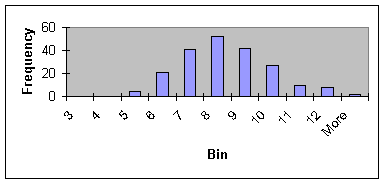
Instead of conducting a chi-squared test, we prefer to visually examine
the data by constructing a histogram. Figure
1 shows the histogram of HgbA1C levels in our data.
Figure
1: Distribution of HgbA1C data
The distribution is symmetric and peeks in the
middle; in short it has a bell shaped curve as expected from a Normal
distribution. Therefore, the fourth
assumption that observations have a Normal distribution is not rejected.
The
fifth assumption is about equality of variances of observations across time
periods. Analysis of Variance
(ANOVA) can be used to test the equality of variance of observations in
different time periods. Here again,
we prefer to test the assumption quickly through calculating average ranges.
When the ranges of observations in different time periods are not two or
three multiples of each other, then we accept the assumption of equality of
variance. In this case, average
ranges differ from low of 5.8 to high of 11.6; all seem to be within the same
ballpark. Therefore, we accept the
assumption of equality of variances over time. 2. Determine the Average of observations in each time period
Table 1 shows the average of observations for each time period.
In Table 1, each row represents an individual patient and each column is
a separate time period. The
observations for each column are summed and then divided by the number of
observations for that time period.
Ai
= åj=1…ni Aij / ni
In the above formula, Ai is the average of
observations for time period i, Aij is the observation ‘j’ in
time period “i”, and ni is the number of observations for time
period i. Table 1: Data for patients of provider 1 over 7 time periods
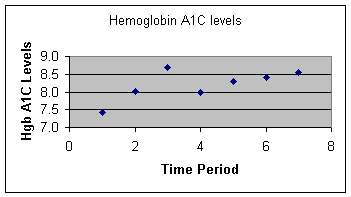
3. Create a Plot of averages over time
A plot can help tell a story much more effectively than any statistic.
After calculating the averages for each time period, we create an X-Y
plot of averages against time periods. This
is shown in Figure 2.
Figure
2:
Average HgbA1C for Provider 1
over all 7 time periods
4. Calculate expected values
The purpose of risk adjustment is to determine if outcomes have improved
beyond what can be expected from the patients’ condition. If they have, then the clinician has provided better or worse
than expected care. If not, changes
in patients’ conditions explain the outcomes and quality of care has not
changed. Extensive literature
exists regarding factors that increase risk of complication from diabetes.
Many of these, for example smoking, are factors that clinicians can
encourage patients to change. To
measure risk, we decided to focus on variables that providers have little
control over and that could make the diabetes control more difficult.
We looked at age of onset of diabetes, as data show that patients will
have less control on their diabetes over time.
We looked at number of medications, as patients’ ability to control
their diabetes maybe hampered by their need to take medication. For the 60 patients of five providers in our sample data, we
regressed HgbA1C levels (averaged across time periods) on two independent
variables: number of medications and age of onset of Diabetes.
Table 2 shows the result of the regression.
Table
2: Regression of HgbA1C on three
dependent variables
We used the regression equation to predict expected
HgbA1C levels for each patient at each time period. The equation we used is given below:
Hgb A1C level = 8.58 + 0.76*( # meds) + (-.03)*(age of onset)
For each patient at each time period, we calculated a predicted HgbA1C.
For example, for patient one at 3 months (the first time period) the
number of medicines was 3 and the age was 65.
Using the above regression equation, we calculated the expected level of
8.2. The calculated values are our
expectation regarding the patients’ ability to control their diabetes.
Table 3 shows the observed and expected values for one provider in two
time periods.
Table
3:
Expected and observed values for
two time periods for Provider 1
5. Calculate average of expected values for each time period
To calculate the average of the expected values for a specific time
period, Ei , add all expected values in that time period and divide
by the number of observations. If
Eij is the expected value for the patient “j” in time period “i”,
then the average of these values, Ei, can be calculated as follows: Ei
= åj=1…ni Eij / ni
For the first 3 months in Table 3, the average of
expected values is 8.2 and for the second 3-month period the average of the
expected values is 8.4. The
following expected averages for subsequent time period for this one provider
were 8.3, 8.3, 8.6, 8.2 and 8.6. 6. Calculate the standard deviation of the difference between observed and expected valuesSuppose
Dij shows the difference between observed and expected values for patient “j” in time
period “i”, that is:
Dij
= Aij
- Eij
Furthermore, suppose
Di
is
the average of the differences for the time period “i”, that is:
Di
= åj=1…ni Dij / ni
Then, standard deviation of the differences, Si, is
calculated as:
Si
= [åj=1,…,ni
(Dij
-Di
)2
/ (ni
-1)]0.5
Note that the standard deviation of each
time period depends on the number of observation in the time period.
As the number of observations increase, standard deviation decreases and,
as we will see shortly, control limits are set tighter and chances for observing
points out of the control limits increases.
The calculation of standard deviation using the first two time periods
for the 21 patients of 1 provider are shown in Table 4:
Table
4:
Calculation of standard
deviation of differences for 21 patients in 2 time periods
7. Calculate and plot the control limits
Control
limits are typically set two or three standard deviations away from the expected
values. When the limits are set at
two standard deviations away from the expected values, then 95% of the values
are expected to fall within the limits. There
is 5% chance to erroneously conclude that the system is out of control, when in
fact it is not. When the limits are
set three standard deviations away from the expected values, 99.7% of the data
are expected to fall within limits. Then
the chance of making an erroneous conclusion drops to 0.3%.
Tighter limits are chosen when the cost of making an erroneous conclusion
is high. Wider limits are chosen
when it is important to detect changes in the process, even if occasionally (5%
of time) one makes an erroneous conclusion. UCLi
= Ei + t * Si
In this equation, “t” is a constant that depends
on the number of cases used in the time period and the confidence interval
adopted. Table 5 gives the “t”
values for various sample sizes and confidence intervals.
Table
5: t-values for various sample sizes and confidence intervals
Thus, for the 10 cases in time period
one, the UCL1 is calculated to be:
UCL1
= E1 + t * S1 UCL1 = 8.6 + 2.22 * 1.26
The lower control limit for time period “i”,
shown as LCLi, is calculated as: LCLi
= Ei - t * Si
Thus, for the 10 cases in the first time
period, the LCL1 is calculated to be:
LCL1
= E1 - t * S1
LCL1
= 8.6 - 2.22 * 1.26 = 5.81
Sometimes lower control limits are negative numbers.
If it is not possible to observe negative number, as often is the case,
the lower control limit is set to zero. In
this case, the lower control limit is a positive number and therefore we do not
need to change it. When control
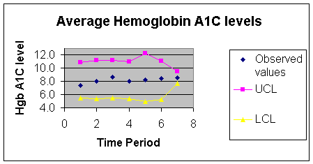
limits have been calculated for all time periods, then these limits are plotted. The following Figure 3 shows the observed values plotted
against seven time periods for cases of one provider.
Lower and upper control lines are superimposed on these figures to enable
quick interpretation of the findings. Similar
figures can be constructed for other providers, thus making it possible to
compare provider’s performance despite differences in their case mix. Figure
3: Control Chart for Provider 1
8. Interpret findings
Any points that fall within control limits are
variations that can be expected by chance alone. Points outside the two limits indicate observations that are
not within our expectations. For
example, in the diabetes data, a point above the control limit indicates a time
period in which patients’ HgbA1C is worst than expected. Any point below the LCL indicates a time period in which
HgbA1C are better than expected. In
our data, no points were outside control limits.
Therefore, over time both clinicians had maintained the HgbA1C of their
patients at the same level. Interventions
to encourage patients to lower their HgbA1C had not paid off beyond what could
have been expected from patients’ conditions. 9. Distribute the chart and the findingsIn the final step, the chart
and the findings are distributed to the improvement team.
In providing feedback about the data, make sure that you follow these
principles:
|
||||||||||||||||||||||||||||||||||||||||||||||||||||||||||||||||||||||||||||||||||||||||||||||||||||||||||||||||||||||||||||||||||||||||||||||||||||||||||||||||||||||||||||||||||||||||||||||||||||||||||||||||||||||||||||||||||||||||||||||||||||||||||||||||||||||||||||||||||||||||||||||||||||||||||||||||||||||||||||||||||||||||||||||||||||||||||||||||||||||||||||||||||||||||||||||||||||||||||||||||||||||||||||||||||||||||||||||||||||||||||||||||||||||||||||||||||||||||||||||