 |

|
|
|||||||||||||||||||||||||||||||||
To understand assumption of X-bar chart
To be able to construct an X-bar chart using Excel.
To be able to interpret the meaning of findings from X-bar chart
There are two reasons why to construct a control chart.
To discipline intuitions. Data on human judgment show that we, meaning all of us including you, have a tendency to attribute system improvements to our own effort and skill and system failure to chance events. In essence, we tend to fool ourselves. Control charts help see through these gimmicks. It helps us see if the improvement is real or we have just been lucky.
An example may help you understand my point. In an air force, a program was put in place to motivate more accurate bombing of targets during practice run. The pilot who most accurately bombed a target site, was given a $2,000 bonus for that month. After a year of continuing the program, we found an unusual relationship. Every pilot who received a reward did worse the month after. How is this possible? Rewards are supposed to encourage and not discourage positive behavior. Why would pilots who did well before do worse now just because they received a reward? The explanation is simple. Each month, the pilot who won did so not because he/she was better than the others but because he/she was lucky. We were rewarding luck; thus, it was difficult to repeat the performance next month. Control chart helps us focus on patterns of changes and go beyond a focus on luck.
In a field like medicine, over time a poor outcome occurs the natural tendency is to think of it as poor care. But such rash judgments are misleading. In an uncertain field such as medicine, from time to time there will be unusual outcomes. If you focus on these occasional outcomes, you would be punishing good clinicians whose efforts have failed by chance. Instead, focus on patterns of good or bad outcomes. Then you know that the outcomes are associated with the skills of the people and the underlying features of the process and not just chance events. Control charts help you see if there is a pattern in the data and move you away from making judgments about quality through case by case review.
To tell a story. P-charts display the change over time. These charts tell how the system was performing before and after we changed it. They are testimonials to the success of our improvement efforts. Telling these types of stories helps the organization to:
celebrate small scale successes, an important step in keeping the momentum for continuous improvement.
communicate to others not part of the cross functional team. Such communications help pave the way for eventual organization wide implementation of the change.
You can of course present the data without plotting it and showing it. But without charts and plots, people not be able to see the data. Numbers makes people understand the data but plots and charts, especially those drawn over time, make people connect a story with the data, they end up feeling what they have understood. For many people seeing the data is believing it. When these charts are posted publicly in the organization, control charts prepare the organization for change. They transfer and explain the experience of one unit of the organization to other units.
P-charts were designed for monitoring the performance of manufacturing firms. These charts assume that the input to the system is the same at each time period. In manufacturing this makes sense. The metal needed for making a car changes little over time. But in health care this makes no sense. People are different. People are different in their severity of illness, in their ability and will to recover from their illness and in their attitudes toward heroic interventions to save their lives. These differences affect the outcomes of care. If these differences are not accounted for, we may mistakenly blame the process when poor outcomes were inevitable and praise the process when good outcomes were due to the type of patients arriving at our unit. Some institutions receive many severely ill patients. These institutions would be unfairly judged if their outcomes are not adjusted for their case mix before comparing them to other institutions. Similarly, in some months of the year, there are many more severely ill patients. For example, seasonal variations affect the severity of asthma. Holidays affect both the frequency and the severity of trauma cases. But even more significant source of change in the severity of illness of our patients is our own actions. Many process changes lead to changes in the kinds of patients attracted to our unit. Consider for example, if we aggressively try to educate patients for the need for avoiding C-section, we may get a reputation for normal birth delivery and we may attract patients who have less pregnancy complications and wish for normal birth delivery. In the end, our report that we have reduced c-sections in our unit is not true, all we have done is to attract a new kind of patients. Nothing fundamentally has changed in our processes, except for the input to the process. Risk adjustment of control charts is one method of making sure that the observed improvement in the process are not due to changes in the kind of patients that we are attracting to our unit.
 |
|
Figure 1: X-bar chart is best when there
are multiple observations |
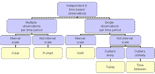
When tracking data over time, you have a number of options. You could use a P-chart, designed specifically to track mortality or adverse health events over time. You could use an X-bar chart designed for tracking health status and satisfaction surveys of a group of patients over time. You could use a moving average chart to help you construct control chart for an individual patient's data over time. This section helps you decide which of these various charts are appropriate for your application. If you do not have a specific application in mind or if you wish to learn more about each of the various different charts, skip this section. In the following, we ask you 4-7 questions and based on your answers advise you which chart is right for the application that you have in mind.
Have you collected observations over different time periods?
This section covers a new type of control charts specially set up for analysis of average satisfaction rating or average health status data. If you do not know how to measure patients' satisfaction or health status, please review these two lectures before proceeding.
For example, in analyzing satisfaction ratings, X-bar charts are used to track changes in average satisfaction ratings over time. In analysis of health status of a group of patients, X-bar charts are used to trace the group's health status over time.
Learn by doing
In this section, we introduce X-charts one step at a time. It is important that you take each step and complete the assignment in the step before proceeding. To help you understand the steps, we provide you with data and ask you to analyze this data as we proceed. The lecture ends when you have completed an X-bar chart and faxed it to me. The only way you can learn about control charts is to do some. You learn by doing. You gain confidence in your own ability to create control charts when you do some. Do not just read these pages. Get a piece of paper and do the exercises as you proceed.
Here is the data we need to analyze. Over several months, we tracked the satisfaction with our unit. The following Table shows the data for these months.
| Time Period | Ratings of 1st Subject | Ratings of 2nd Subject | Ratings of 3rd Subject | Ratings of 4th Subject | Average Rating |
| 1 | 80 | 84 | 82 | 80 | ? |
| 2 | 70 | 72 | 74 | 70 | ? |
| 3 | 76 | 78 | 76 | 78 | ? |
| 4 | 80 | 78 | 78 | 80 | ? |
The question we have is whether the unit has improved over time. How would you answer this question? Look at the data. There are wide variations in the data. Could these variations be due to chance? The first step is to calculate the average for each time period. Calculate average rates by summing the ratings in each time period and dividing by the number of cases in that period. Thus, for the first time period, the average will be 80+84+82+80 divided by 4, which is 81.5. Do not proceed until you have calculated the averages for all time periods. Then, you need to plot the data. Numbers are deceiving. They hide much. To understand numbers you must see them. The next step is to create a x-y plot; where the x-axis is time and the y-axis is the average satisfaction rating. Create a x-y plot of the data before proceeding further.
Before we go further, let me do what you have done so far. Let me plot the data so that you can compare your work against mine. In the picture below, you see the data for the four time periods.
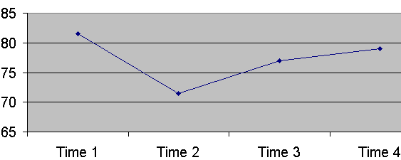
Figure 2: Average Satisfaction Rating Over Time
The x-y plot you have created already tells you a lot. But it will tell you more, if you add to the plot the upper and lower control limits, between which one expects 95% of the data. The upper and lower control limits in an X-bar chart is based on the assumption that data are normally distributed. So before we calculate these limits, we need to check and see if the assumptions are met.
Continuous Interval Scale. The variable being averaged must be a continuous variable on an interval scale, where the differences between the scores are meaningful. An ordinal scale cannot be averaged. Satisfaction rating and health status ratings are generally assumed to be interval scales.
Independent events. The observations over each period of time are not affected by the previous observations. In our example, the satisfaction ratings in time period two should not be affected by ratings in the first time period. This assumption will be violated in an example where the same patient is rating the unit in every time period. It is likely that this patient's first impression affects subsequent evaluations. The assumption seems reasonable when different patients are rating in different time periods.
Normal distribution. If we were to stack all the ratings, most will fall on the average rating, some on each side. A normal distribution suggests that the stack will peek on the average, slowly decline on both sides of the average, and the shape of the curve will be symmetrical. The law of large numbers says that no matter what the distribution of a variable is, the average of the variable will tend to have a Normal distribution. As the number of cases for calculation of the average increases, the average is more likely to be Normal. A minimum of four cases is needed for applying the law of large numbers. The law of large numbers tells us that the average of any distribution, no matter how strange, has a Normal distribution.
Constant variance. This assumption can be verified on a control chart. It states that deviations from the average should not consistently increase or decrease over time.
When the assumptions of Normal distribution are met, we can proceed to the next step of calculating upper and lower control limits.
Calculate and plot the grand average. The grand average is the average of all ratings across all time periods. Do not calculate this by averaging the mean of each time period. The correct way to do this is to sum all the ratings for all time periods and divide the sum by the number of ratings. In the example provided here, it makes no difference how you calculate the grand average, but in situations where the number of cases in each time period is changing, it does make a difference. Please calculate the central tendency of the satisfaction ratings and plot it on your x-y plot before proceeding further. This is how it will look like now:
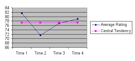
Figure 3: Averaged Ratings Are Better Understood When Central Tendency Is Plotted
With the central tendency line in, we have a visual line to compare the data to. It already tells us a lot, it gives us a sense of which time periods are closer to our central tendency line.
If you notice, in some time periods you have larger differences from the central tendency line than in others. The question arises whether these differences are so large that they are beyond what could be expected from chance events. To answer this question we need to add two other lines to our plot. These are upper and lower control limits. Then points beyond these limits are differences that could not be due to chance. They indicate real changes in the patients' satisfaction with our services. To calculate the upper control limit follow these steps:
Calculate the lower limit for each time period as the grand average minus 1.96 times the standard deviation of that time period.
On your chart, plot the upper and lower control limits. Note that the control limits are the same at each time period and the control limits are symmetrical around the grand average. Calculate and plot the upper and lower control limits for each time period. This is how the control chart will look like when you complete your work.
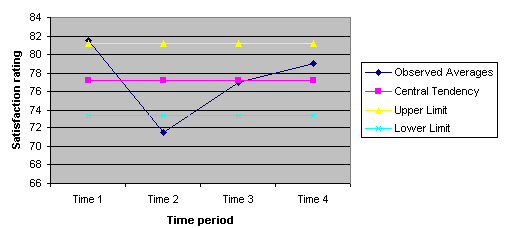
Figure 4: Adding in Control Limits
Note that the control limits are straight lines in this example because in every time period we sampled the same numbers of cases. If this were not the case, the control limits would be tighter when the sample size was larger. If observations fall within the control limits, then the change in the observed rates may be due to chance. Note also that the second time period is lower than the lower control limit. Therefore, patients rated our services worst in this time period and the change in the ratings were not due to chance events. It marks a real change in satisfaction with our services. We would not have known this until we created a control chart. Examine the plot that you created. Remember that we are trying to answer the question of whether there has been improvements in the process. Look at the plot. What does it tell you. Is it easier to understand the data now that you have plotted it and put limits around the data?
Now that you have learn how to create an x-bar chart, you can move on to creating a risk-adjusted x-bar chart. In these charts, outcomes of care are compared to expected outcomes given the patients case mix, severity or prognosis. For more see continuation of lecture on risk adjusted x-bar charts. More► Another Example►
There are three sets of presentations for this lecture:
Use Excel to create Xbar chart Excel 2003► Video► SWF►
Use Excel to create risk adjusted X-bar chart Excel 2003►
Narrated slides and videos require Flash.
Advanced learners like you, often need different ways of understanding a topic. Reading is just one way of understanding. Another way is through analyzing data. The enclosed questions are designed to get you to think more about the concepts taught in this session. Download data for this assignment Download►