 |

|
Time-between Charts |
||||||||||||||||||||||||||||||||||||||||||||||||||||||||||||||||||||||||||||||||||||||||||||||||||||||||||||||||||||||||||||||||||||||||||||
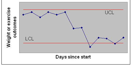
IntroductionIn this section, you will learn about constructing Time-between charts and interpret the findings. We focus on constructing a control chart for time between negative patient experiences, as documented in patient reviews. Other applications are also possible and you will see examples of application of control charts to maintaining exercise or diets, relapse to drug use, or time between asthma attacks at end of this section. This section assumes that you can plot data, take a square root and calculate means. These are relatively simple tasks but some people may have little experience with any data manipulation. Tutorials on how to do these tasks are also available at end of this section. Why Construct a Control ChartControl charts can help discipline intuitions. Most people read too much into their success and attribute their failures to external events. For example, there are considerable variations among patient experiences, some positive and some negative. Many providers read too much into an occasional complaint and fail to see patterns among patient experiences. A time between control chart can help us understand if patient experiences are improving or getting worse. It will focus the attention on the pattern across these experiences as opposed to any single comment. For another example, in weight loss there are considerable variations depending on timing of weight measurement, instruments used to measure the weight, clothes on the person while weight is measured, recent food intake, whether, and many other sources. These variations lead to unreliability in the measure of weight. It would be a fallacy to see these variations as weight loss or gain. Control charts can help remove the guess work. These charts establish if new values are different from historical values. Control charts can help answer whether your new weight and exercise patterns indicate a departure from their historical levels. What is a Control Chart?In a control chart, you monitor your progress over time. You create a plot, where the X-axis is days since start and the Y-axis is the outcome you are monitoring. To decide if your outcomes are different from historical patterns, the upper (UCL) and lower control limits (LCL) are calculated. These limits are organized in such a way as to make sure that if your historical pattern has continued then 99% of time data will fall within these limits. The upper and lower control limits are calculated using mathematical formulas that are specific to the type of outcome you are monitoring. This section shows you how to calculate these limits depending on whether you are monitoring patient experiences, your weight, your exercise time, days diet missed, days exercise missed, or other similar outcomes. Figure 1 shows the structure of a typical control chart. In this figure, all points, except for one, fall within the control limits.
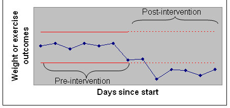
How to Read a Control Chart?A control chart is useful in many different ways. Points outside the limits are unusual and mark departure from historical patterns. If you tracking patient experiences, a point outside the limit indicates an unusual pattern of experiences. Two points in Figure 1 fall below the LCL and therefore mark a departure from historical patterns loss. All other points do not indicate any real change, even though there are lots of variation. These small fluctuations are random and not different from your historical changes rise and falls in your weight. You can also use the control chart to see if you are maintaining your gains in a previous time periods. If your data falls within the control limits, despite day to day variations, there has not been any change. If the process is producing results you need, then you want your data to fall within the limits. Minimum Number of ObservationsThe more data you have, the more precision you have in constructing the upper and lower control limits. Not all of the data are used for calculation of control limits. Often, the limits are based on pre-intervention period. Then subsequent post-intervention observations are compared to the pre-intervention limits. At a minimum, you need at least 7 data points in the pre-intervention period to start most charts. When you make a change, you want to see if patient experiences have been affected by the change. In these circumstances, you set the limits based on the pre-intervention data. You compare post-intervention findings to these limits. If any points fall outside the limits, you can then conclude that the intervention has changed the pattern of patient experiences. See Figure 2 for an example of limits set based on pre-intervention periods.
Compare the chart in Figure 2 with the chart in Figure 1. Both are based on the same data, but in Figure 2 the limits are based on the first 7 days, before the intervention. Figure 2 shows that post intervention data are lower than LCL and therefore a significant change has occurred. When Figure 2 is compared to Figure 1, we see that more points are out of the limits in Figure 2. By setting the limits to pre-intervention patterns, we were able to detect more accurately the improvements since the intervention. The length of data used in construction of control limit depends on the timing of the intervention and changes in the underlying process. Use at least 7 data points before the start of the intervention to set the control limit. You can, of course, use more data points to get a more stable picture of the process but keep in mind that as you use more data points you are going back further in time. The more distant the data the less relevant it is to the current situation. There is a practical limit of how far back you should go. Taking data from months ago may make your analysis less accurate, if the process has changed since then. Assumptions of Time-between Charts
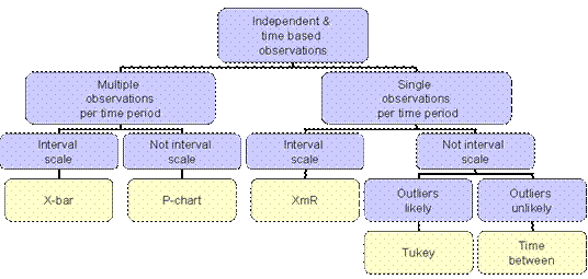
Time-between charts is one method of constructing control charts, there are many more ways to construct a control chart. Time between charts are best best suited when four assumptions are met: (1) Data should have been collected over time with one observation per time period. (2) The chart should be drawn for dichotomous, discrete rare event. For example, Time-between charts can be constructed for days to diet-missed, exercise-missed, coffee, junk food, unsatisfied customer, next adverse event, suicide, wrong side surgery, smoking, etc. (3) Observations over time should be independent of each other. Knowing the value of observation at one time period should not change the probability of observation at next time period. (4) The time to the event should have a Geometric distribution, in which longer time to the event is increasingly more rare. There are many other methods of control chart that are also available (see Figure 3 for examples). You could use a P-chart, designed specifically to track mortality or adverse health events over time. A P-chart is reasonably only if the event of interest is not rare. You could use an X-bar chart designed for tracking health status and satisfaction surveys of a group of patients over time. You could use a moving average chart to help you construct control chart for an individual patient's data over time. This section helps you decide which of these various charts are appropriate for your application. If you do not have a specific application in mind or if you wish to learn more about each of the various different charts, skip this section. In the following, we ask you 4-7 questions and based on your answers advise you which chart is right for the application that you have in mind. Have you collected observations over different time periods? Calculating Limits for Time-between ChartsThe steps in constructing control limits for time in between charts are:
An ExampleTable 2 shows data collected over 18 days by a 35 year old female trying to exercise more. She decided to take morning showers at the gym and thus combine her exercise and shower routines. The first 10 days show the data before the intervention. The remaining days show the data after the intervention. The question was whether this new habit has led to increased use of the gym.
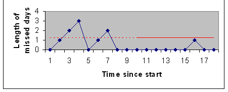
To construct the control chart, we first need to use the rules in Table 1 to calculate the number of consecutive complaints in Table 2. Note that the number of consecutive complaints increases until a positive comment is received, at which point they are re-set to zero. The last column in Table 2 shows the calculated number of consecutive complaints. The control limit can be calculated from either the pre- or the post-intervention data, which ever leads to a lower upper control limit. In this case the control limit is calculated form the post intervention data, the data for days 8 through 18, because it has the least variability. There is 1 complaint and 8 positive comments. Therefore, R is calculated as 1/8 = 0.13. The UCL is then calculated as: Figure 5 shows the resulting chart and control limit.
Interpretation of Time-between Control ChartIf the observations in the control chart exceeds the Upper Control Limit, then these observations are unlikely to occur by chance. They signify a change in the underlying frequency of the event being tracked. If the control limits were based on pre- or post-intervention periods, observations above control limit indicate the impact of the intervention. Of course, it is possible that the change in probability of the event might be due to another event not tracked in the control chart. Therefore, attribution of change in the probability of the event to the intervention should be made with caution. The chart in Figure 5 shows that in the pre-intervention period patients had two strings of consecutive complaints. In the first string, patients complained 4 times in a row. In the second string, patients complained 2 consecutive times. Both strings exceed the UCL. Compared to post intervention period, these two strings of complaints are long enough to constitute a real change in the process. Based on these findings, we conclude that the intervention was working and the rate of complaints has dropped. ConclusionThe point of any control chart is to help you improve. The effort we put into measurement and analysis is wasted if it does not help us improve. Constructing a control chart is time consuming and, for some, difficult. But what is the alternative. Many err in detecting real changes. They mistake random fluctuations in patient experiences as real change. Control charts help discipline our intuitions to see beyond occasional complaints and focus on patterns. Analyze DataAdvanced learners like you, often need different ways of understanding a topic. Reading is just one way of understanding. Another way is through doing and practicing the concepts learned in this section. The enclosed date are designed to get you to think more about the concepts taught in this session.
PresentationsThere are six sets of presentations for this lecture:
Listening to narrated slides and videos may require Flash►
More
|
||||||||||||||||||||||||||||||||||||||||||||||||||||||||||||||||||||||||||||||||||||||||||||||||||||||||||||||||||||||||||||||||||||||||||||
|
This page is copyright protected by Farrokh Alemi, Ph.D.. This page is part of the course on quality / process improvement, lecture on Time-between charts. This page was first made on Wednesday, November 06, 2002 and most recent revision was on 1/1/2006 |
||||||||||||||||||||||||||||||||||||||||||||||||||||||||||||||||||||||||||||||||||||||||||||||||||||||||||||||||||||||||||||||||||||||||||||