|
||||||||||||||||||||||||||||||||||||||||||||||||||||||||||||||||||||||||||||||||||||||||||||||||||||||||||||||||||||||||||||||||||||||||||||||||||||||||||||||||||||||||||||||||||||||||||||||||||||||||||||||||||||||||||||||||||||||||||||||||||||||||||||||||||||||||||||||||||||||||||||||||||||||||||||||||||||||||||||||||||||||||
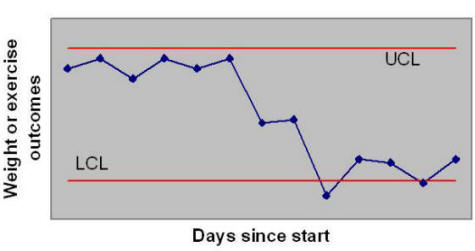
Tukey Control ChartThere are many different types of charts. P-charts are useful for analysis of mortality data but assume large number of observations. X-bar charts are useful for analysis of satisfaction ratings but assume Normal data. We present here an approach based on Tukey’s exploratory data analysis techniques. The approach is robust and makes no assumptions regarding the distribution of outcomes plotted. We refer to this approach as Tukey's Chart. In a control chart, you monitor progress over time. You create a plot, where the X-axis is days or weeks since start and the Y-axis is the outcome you are monitoring. To decide if your outcomes are different from historical patterns, the upper (UCL) and lower control limits (LCL) are calculated. These limits are organized in such a way as to make sure that if your historical pattern has continued then 99% of time data will fall within these limits. This section shows you how to calculate limits for Tukey charts - a type of chart useful for analyzing single observations per time period. ) Figure 1 shows the structure of a typical control chart. In this figure, all points, except for two, fall within the control limits.}
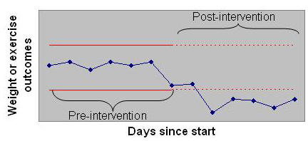
Figure 1: Components of a Control Chart How to Read a Control Chart?In a control chart, points outside the limits are unusual and mark departure from historical patterns. Two points in Figure 1 fall below the LCL and therefore mark a real change. All other points do not indicate any real change, even though there are lots of them showing a rise or fall. These fluctuations are random and not different from historical changes. A control chart can be used to see if a process is stable, meaning that observations are falling within anticipated limits. If your data falls within the control limits, despite day to day variations, despite attempts to change the process, outcomes have not changed. Minimum Number of ObservationsThe more data you have, the more precision you have in constructing the upper and lower control limits. At a minimum, you need at least 7 data points in the pre-intervention period to start a Tukey chart. This is an absolute minimum and not a recommended number. The actual number you need depends on the consequence of waiting and collecting more data versus using too little data and making an error in judgment. Keep in mind that not all of the data you collect are used for calculation of control limits. Often, the limits are based on pre-intervention period. Then subsequent post-intervention observations are compared to the pre-intervention limits. When you make a change, you want to see if the change has affected the outcomes. In these circumstances, you set the limits based on the pre-intervention data. You compare post-intervention findings to these limits. If any points fall outside the limits, you may then conclude that the intervention has changed the outcomes. See Figure 2 for an example of limits set based on pre-intervention periods. The solid line shows the time period used to set the limit, the dashed line is an extrapolation of the limit to other periods.
Figure 2: Post-intervention data compared to limits set based on pre-intervention data Compare the chart in Figure 2 with the chart in Figure 1. Both are based on the same data, but in Figure 2 the limits are based on the first 7 days, before the intervention. Figure 2 shows that post intervention data are lower than LCL and therefore a significant change has occurred. When Figure 2 is compared to Figure 1, we see that more points are lower than LCL in Figure 2. By setting the limits to pre-intervention patterns, we were able to detect more accurately the improvements since the intervention. Control limits can be calculated from either the pre or the post intervention period and projected over to the other period. For example, control limits can be calculated from per-intervention period and extended to the post-intervention period. Or the reverse: control limits can be calculated from the post-intervention period and extended to the pre-intervention period. Either way, we are comparing the two periods against each other. But since the results will radically differ, it is important to judiciously select the time periods from which the control limits are calculated. The selection depends on the inherent variability in the pre- or post-intervention periods. Control limits are calculated from the time period with least variability. Typically, this is done by visually looking at the variability in the data or at the range of the data in pre- and post-intervention time periods. But in Tukey chart, outliers may appear to cause variability but do not affect the control limit calculations. Therefore, instead of visual tests or instead of looking at range of data, it is important to calculate the Fourth Spread (a concept explained in next section) and to select the time period with the smallest fourth spread. This will produce control limits that are tighter and more likely to detect changes in underlying process. Figure 3 shows the control limits derived from pre-intervention data. The control limits are calculated from the pre-intervention period and shown as solid red line. They are extended to the post-intervention period, shown as dashed red line. The control chart compares the observations in the post intervention period to the control limits derived from the pre-intervention period.
Figure 4 shows the control limits for the same data drawn from a post-intervention data. Note that this time around the control limits are calculated from the post intervention period, shown as solid red line. They are extended to the pre-intervention period, shown as dashed red line. The control chart compares the pre-intervention observations to the control limits calculated from the post-intervention data.
Note that both analyses are based on the same data. Both analyses compare the pre- and post-intervention data by contrasting the observation in one period to control limits derived from the other period. In one case, the control limits are drawn from the pre-intervention period and in the other from the post-intervention period. Note the radical difference of the control limits derived from the two time periods. The Fourth Spread (a concept explained in the next section) for the pre-intervention period is 10 points while for the post-intervention period it is 18 points. Figure 3 is the correct way to analyze the data, because it is based on the control limits derived from the pre-intervention period, the time period with smallest Fourth Spread. If control limits are based on the time period with the smallest Fourth Spread, they would be tighter and more likely to detect smaller changes in the underlying work process. Calculating LimitsWe will use Tukey’s suggested limits for calculation of confidence intervals. The procedure calculates control limits from difference of upper Fourth and lower Fourth of data, a concept that Tukey named Fourth Spread. Most readers are familiar with median, a value where half the data are below and half the data are above it. A lower Fourth is similar to 25% quartile and is the median of the first half of the data. At this point, 25% of the data are below this value. An upper Fourth is similar to 75% quartile and is the median of the upper half of the data; at this point 75% of the data are below this value. The difference between the two Fourths is referred to as Fourth Spread. The Upper Control Limit is calculated as the sum of the upper Fourth and 1.5 times the Fourth Spread. The Lower Control Limit is calculated as the difference of the lower Fourth and 1.5 times the Fourth Spread. Here are the procedure for calculating Tukey’s control limits:
LCL = Lower Fourth - 1.5 * Fourth Spread UCL = Upper Fourth + 1.5 * Fourth Spread
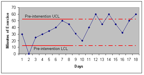
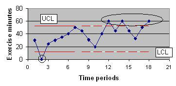
Example in Exercise Time & Weight LossJane collected data in Table 1 regarding her exercise times. She planned to exercise 3 times a week and each time she exercised she recorded the time in minutes. When she did not exercise, she recorded a 0 for the length of exercise. The first 7 days recorded were pre-intervention. After this period, she and her spouse joined a mixed group volleyball team. The question she wanted to know was whether joining the team had made a difference in her exercise time.
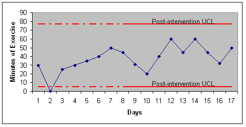
We can calculate the control limits from the pre-intervention or post-intervention period. It so happens that the limits calculated from the pre-intervention period are tighter (meaning the difference of upper and lower control limit is smaller) and therefore the following shows how to calculate the control limits from the pre intervention period. While we focus on setting the limits from the pre-intervention period, in reality you should do it from either period and select the time period that produces the tighter control limits. The first step is to sort pre-intervention data in order of length of exercise. This is shown in Table 1 in the last column of the Table. Next, we calculate the median, this is the value where ½ the data (7 * .5 = 3.5, 3 points) are below it and ½ the data (3 points) are above it. The 4th data point with value of 30 is the median; 3 data points are below it and 3 above it. Since median is an actual data point, we include this point in the lower data set. To calculate the Lower Fourth, we calculate the half way point for the first half of the data. When we include the median, we have 4 points in the lower data set. The 25% quartile is halfway between the second and third point, in other words between 25 and 30, which is 27.5. To calculate upper Fourth, we calculate the half way point for the upper half of the data. Again because the median is an actual data point, we include this point in the upper dataset. With the median, we have 4 data points from Median to the highest values. The upper Fourth is between the 5th and 6th data points (between 35 and 40), and therefore its value is 37.5. The Fourth Spread is the difference between the upper and lower Fourth, which is 37.5-27.5 = 10. The Fourth Spread for the control limits calculated from post-intervention data is 18 points and this is why we have selected to calculate control limits from pre-intervention data. The UCL is calculated as 37.5+1.5*10 = 52.5. The LCL is calculated as 27.5-1.5*10 = 12.5. A chart of the data is provided in Figure 5:
Figure 5: Tukey's Control Chart for Data in Table 1 Examination of the chart shows that in the first seven days, there was one very low point of no exercise, a statistical abnormality. After the first 7 days (used for setting the limits), on 3 occasions the total exercise time exceeded the UCL. In these three days, there was a real increase in exercise time compared to the first 7 days. If these days correspond to joining the volleyball team, then the intervention seems to have worked. Let us look at another
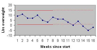
example, this time on weight loss. A male, 48 year old man measured his weight
for 8 weeks. Then he and his spouse changed food shopping habits. They excluded
all sweets from their shopping (they stopped buying pops, sweetened
cereals, and chocolates for the house). The data for this person is
provided in Table 2. Weight was recorded once a week.
As before, we need to calculate the control limits for pre and post-intervention periods and select the limits with the smallest difference. It so happens that that the pre-intervention period has the smallest Fourth Spread and therefore we show the calculation of control limits from these data. The first step is to sort pre-intervention data from least amount of pounds over weight to the highest value. This is shown in Table 2 in the last column of the Table. Next, we calculate the median, this is the value where ½ the data (8 * .5 = 4 points) are below it and ½ the data (4 points) are above it. The value should be between 4th and 5th data points, or between 7 and 8, so the median is 7.5. Since median is not an actual data point, we do not include this point in the calculations of Fourths. To calculate the lower Fourth, we pick the half way point for the first half of the data. We have 4 points in the lower data set. The Lower Fourth is halfway between the 2nd and 3rd point, in other words between 5 and 7, thus it is 6. To calculate the Upper Fourth, we calculate the halfway point for the upper half of the data. Again because the median was not an actual data point, we do not include this point in the upper data set. We have 4 data points for the highest values. The Upper Fourth is between the 6th and 7th data points (between 9 and 10), and therefore it is 9.5. The Fourth Spread is the difference between the Upper and Lower Fourth, which is 9.5-6 = 3.5. The UCL is calculated as 9.5+1.5*3.5 = 14.75. The LCL is calculated as 6-1.5*3.5 = 0.75. A chart of the data is provided in Figure 6:
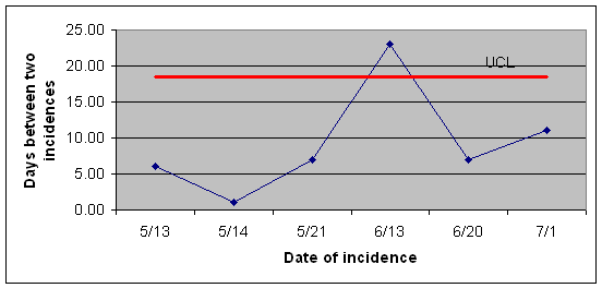
Figure 6: Control chart for the weight data Examination of the chart shows that in the first eight weeks, all data points were within the limit. No weight was lost in the pre-intervention period, even though there was considerable amount of fluctuations. Over the remaining 8 weeks and compared to the first 8 weeks, on 4 occasions the weight was lower than the LCL. Therefore, there was a real decrease in weight in the post intervention period. Example in Medication ErrorsThe following data show the error in PYXIS refills in a hospital.
Note that there are no pre- or post intervention time periods and therefore the entire data can be used for calculation of control limits: To analyze this data we first calculate time between errors:
Next we reorder the observations from lowest days between errors to highest dates: 1, 6, 7, 7, 11, and 23 days. The median for the data is 7. The upper fourth is the median of 7, 11 and 23 and thus it is 11. The lower fourth is the median of 1, 6, and 7 and thus it is 6. The fourth spread is 5 days. The upper control limit is the upper fourth plus 1.5 times the fourth spread which is 18.5. The lower control limit is a negative number and thus it is re-set to zero. Figure 7 shows the control chart:
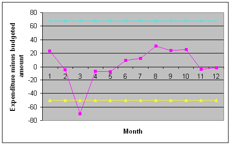
Figure 7: PYXIS Refill Errors Improved from 5/21 to 6/13 Example in Budget VariationSuppose that we are looking at 12 month of data regarding our clinic's budget. The question is whether the expenditures at any particular month are higher than the general pattern across the 12 months. The table below shows the budget deviation (expenditure minus budget amount) for each of the months in thousands of dollars:
Note that there are no pre- and post intervention time periods and therefore the entire data are used for estimation of control limits. The first step is to sort the data:
There are 12 data points, so the median is halfway between the 6th and 7th ranked data points. Therefore, the median is not included in the lower and upper data sets because it is not an actual value in the data. The Lower Fourth is halfway in between the 6 data points with lowest ranks, it is between 3rd and 4th ranked data points and has the value of -6. The upper data set is the points ranked 7 through 12. Median of this data set is halfway in between the 9th and 10th ranked data items. It is 23.5. The Fourth spread is 29.5. The UCL is 23.5+1.5*29.5 and the LCL is -6-1.5*29.5. Figure 8 shows the control chart:
The chart shows that all months are within control limits except for March, where in there has been a large deviation from the budgeted amount. Which Chart is Right?
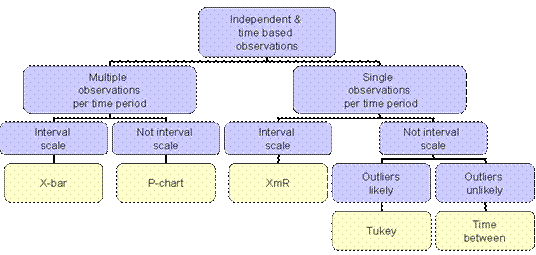
When tracking data over time, you have a number of options. You could use a P-chart, designed specifically to track mortality or adverse health events over time. You could use a moving average chart to help you construct control chart for an individual patient's data over time. This section helps you decide which of these various charts are appropriate for your application. If you do not have a specific application in mind or if you wish to learn more about each of the various different charts, skip this section. In the following, we ask you 4-7 questions and based on your answers advise you which chart is right for the application that you have in mind.! Have you collected observations over different time periods? For more details on comparison of Tukey and Moving Average Control charts (XmR), click here. Analyze DataAdvanced learners like you, often need different ways of understanding a topic. Reading is just one way of understanding. Another way is through doing and practicing the concepts learned in this section. The following questions are designed to get you to think more about the concepts taught in this session.
How Will Your Assignment be Graded?
Email Your AnalysisPlease submit one file containing answers to all questions. Please note that all cell values must be calculated using a formula from the data. Do not enter values in any calculated cells. Calculate each cell using Excel formulas. Email►. PresentationsTo assist you in reviewing the material in this lecture, please see enclosed resources:
Narrated slides and video require use of Flash Download► More
This page is part of the course on Quality / Process Improvement, the lecture on "Tukey Chart." This page was first prepared on January 1990 and last revised 01/15/2017. Copyright protected by Farrokh Alemi, Ph.D. © Copyright 2003. |
||||||||||||||||||||||||||||||||||||||||||||||||||||||||||||||||||||||||||||||||||||||||||||||||||||||||||||||||||||||||||||||||||||||||||||||||||||||||||||||||||||||||||||||||||||||||||||||||||||||||||||||||||||||||||||||||||||||||||||||||||||||||||||||||||||||||||||||||||||||||||||||||||||||||||||||||||||||||||||||||||||||||