 |

|
XmR Charts (Shewhart's Control Chart) |
||||||||||||||||||||||||||||||||||||||||||||||||||||||||||||||||||||||||||||||||||||||||||||||||||||||||||
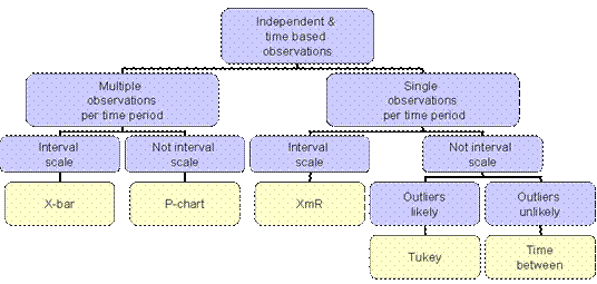
ObjectivesX-bar and p-Charts require considerable data for each time period. Sometimes, we have a single observation per time period. In this section, we show you how to create a chart from single data items per time period. One often runs into these types of data when monitoring an individual. This section teaches the use of XmR (X stands for observation, and mR stands for moving range) charts. The objectives of this session are:
Introduction
One of the most widely used control charts is the XmR chart, first developed by Schwartz. This chart is particularly useful when there is only one observation in each time period. The purpose of constructing any control chart, including XmR chart, is to see if the variation is due to chance or to changes in the process. Every process exhibits some variation in outcomes of care. Controlled variation is stable and consistent over time. This variation is due to chance or inherent features of the process of care. Uncontrolled variation are points outside the limits and these observations cannot be due to chance. They represents a change in the process of care that is affecting outcomes.
Control charts are also used to visually tell a story. Any control chart, including XmR chart, has a set of common elements:
This section describes how an XmR control chart can be organized. Assumptions
We start with a list of assumptions behind construction of an XmR chart:
All of the above assumptions must be met before the use of XmR charts make sense. Please note that XmR charts do not assume that the observed values have a Normal distribution. While observations may come from non-Normal distributions, differences in consecutive values have a near Normal distribution. Control LimitsIf there is an intervention, we need to decide if the control limits should be calculated from the pre-intervention or post-intervention period. Select the period with the least variability and that will produce the tightest control limit. The variability within pre- and post intervention period can be examined visually or by calculating the difference between maximum and minimum value in each time period. Calculate the control limit from the pre-intervention period if it has the smaller difference. Otherwise, calculate the control limits from the post intervention period. Control limits are calculated from one time period and extended to the other so that we can judge if the post and pre-intervention periods differ. Control limits in XmR chart are calculated from moving range (mR). A range is based on the absolute value of consecutive differences in observations. The first step in calculating control limits is to estimate the average of the moving range.
Upper control limit is average of the observations plus a constant E times the average moving range. The constant E depends on how many consecutive observations are included in the moving range. When 2 consecutive observations are examined, the constant is 2.66 for control limits that include 99% of the data. If the moving range is calculated from 2 consecutive time periods then the correction factor E for control limits that include 95% of the data is 1.88. Then the Upper Control Limit (UCL) can be calculated as: UCL = Average of observations + 1.88 * Average of moving range Similarly, lower control limit is average of observation minus 1.88 times the average range. The Lower Control Limit (LCL) is calculated as: LCL = Average of observations – 1.88 * Average of moving range Construction of the ChartOnce the control limits have been calculated, you can construct the control chart. First you plot the x- and y-axis, put time on the x-axis and the observations on the y-axis. Plot the observed values for each time period. Plot the control limits over the entire time period (it is desirable to show the calculated control limit as a solid line and the extended portion as a dashed line). Points within control limits are controlled variations These points do not show real changes, even though data seem to rise and fall. These are merely random variation that has traditionally existed in the process. Points outside the limits show real changes in the process. If a point falls outside the limits, we need to investigate what change in the process might have led to it. In other words, we need to search for a "special cause" that would explain the change. Once a control chart has been constructed, they are useful as a way of telling an improvement story. Distribute the chart by electronic media, as part of company newsletter, or display it as an element of a storyboard. When you distribute a chart, show that you have verified assumptions, check that your chart is accurately labeled, and include your interpretation of the finding. Example
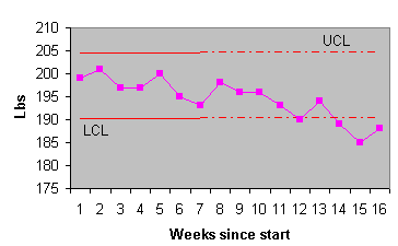
Let’s look at a diabetic patient’s weight. His clinician asked him to weigh himself weekly and to bring the data to their follow-up visit. The patient attempted to lose weight by changing the food shopped for the household. He started the intervention in week 8, so the first 7 weeks show the data prior to the intervention and the remainder show the data post the intervention. The data in the following Table show Jim's weight over time:
The question is whether the patient's new shopping patterns has affected his weight. First we check that all of the assumption of XmR chart are reasonable in this setting. There is one observation per time period; the same patient is monitored so the patients' severity of illness is unlikely to have changed; weight is measured on an “interval” scale, and there is no reason to expect that the observations are dependent on each other.. Therefore, all assumptions seem reasonably met.
Second, we need to make a decision whether to calculate the control limit from either pre-intervention or post intervention data. To make this decision, we need to select a time period with least variability. The range of data (the maximum value minus the minimum value) in the pre-intervention period is 8 Lbs. The range for the post intervention period is 13 Lbs. The pre-intervention period has the lower variability and therefore control limits calculated from this period will be tighter. Therefore, we select to calculate the control limits from the pre-intervention period.
Third, we calculate the average range between any two consecutive values. This is done by calculating the absolute value of the difference of any two consecutive number and then taking the average of these differences:
Fourth, using the averages, we calculate the Upper (UCL) and Lower (LCL) control limits.
UCL = 197.43 + 1.88 * 2.67 = 202 LCL = 197.43 - 1.88 * 2.67 = 192
Fifth, we plot the chart for the entire 16 weeks (Figure 2).
Sixth, we interpret the findings. During the first 7 weeks, no points are outside the control limit. After this period, when food shopping patterns were changed, we see 4 points outside the limit. These points mark a departure from the pattern in the first 7 weeks. They show that the patient's weight has declined. This decline is not a random fluctuation but marks a real change in the process. Analyze DataAdvanced learners like you, often need different ways of understanding a topic. Reading is just one way of understanding. Another way is through doing and practicing the concepts learned in this section. The following is designed to get you to think more about the concepts taught in this session. Question 1. The following data were collected regarding satisfaction with a clinic's service over time (0 means unacceptable care and 100 best possible care).
. PresentationsThere are sets of presentations for this lecture:
Narrated slides and video require use of Flash. More
This page was first prepared on January 1990 and last revised on 01/15/2017. This page is part of the course on Quality/Process Improvement. Main Page► |
||||||||||||||||||||||||||||||||||||||||||||||||||||||||||||||||||||||||||||||||||||||||||||||||||||||||||