![]()
|
|
|
Supplement to Chapter on Tukey ChartPresentations
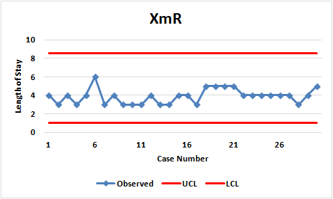
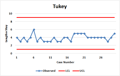
AssignmentsQuestion 1: In health administration programs, data on waiting time are examined in courses on quality and operations research. Using the attached data, determine if the waiting time in our urgent care center has changed? Data► Answer► Question 2: In Hospital Administration Programs, time to adverse events is typically taught in courses on quality. It also may be referred to in courses on strategy, if the hospital is focused on competing based on quality. Hospital Compare reports the measure OP_21. The Score field provides time (in minutes) from emergency department arrival to initial oral, intranasal or parenteral pain medication administration for the patients with a diagnosis of a long bone fracture. The field Sample provides the number of patients used to calculate the time to pain medication. In this assignment, we ask you to track the performance of "Inova Fairfax Medical Center" over two years. Focus on the Score variable. Download Hospital Compare data; these years include data from 2013 to 2015. Merge the file " HQI_HOSP_TimelyEffectiveCare" across all the databases that you have downloaded. Select measure ID: "OP_21" . Construct a control chart showing time between pain medications. The data are reported for a range of time; assume that the data are reported for the mid-point of the range. Download data using the following 9 files: Rationale 2016-11-10.zip► 2016-08-10.zip► 2016-05-04.zip► 2015-12-10.zip► 2015-10-08.zip► 2015-07-16.zip► 2015-05-06.zip► 2015-04-16.zip► 2015-01-22.zip► Construct both a Tukey and a time-between control chart for the data. For the time-between control chart assume that data points above median exceed and observations below median are less than the national average. Answer► Question 3: Analyze the following data using Tukey, XmR and Time-In-Between (more than 30 minutes of exercise considered a successful day) charts. Produce 3 charts and discuss if the findings from the 3 charts are similar. To decide if the exercise time has changed, rely on the control chart with the smallest difference between upper and control limit. Data► Answer► Question 4: The following table shows the observed and expected length of stay for 30 patients. Data►
The conclusions you arrive at based on (a) paired comparison of expected and observed length of stay and (b) the risk-adjusted control charts should be the same if in both situations we were calculating the control limits from the same number of cases. Are they?
More
|
||||||||||||||||||||||||||||||||||||||||||